– Building a new design system and redesigning interface
– Evaluating ideas and new features with customers
– Designing new features from scratch
– Improving existing functionality
– Establishing design process within the company
– Overseeing the entire product design strategy
Find some examples of each of the areas below.
I joined the company as a product designer responsible for working on the ATS (applicant tracking system) project. At the time they had a working MVP that only served the needs of CharityJob clients, but was planned to be a standalone B2B product in the future.
The design system was not implemented at the beginning of this project, and furthermore, the team had been working without a designer for several months after the previous one had left the company, therefore the UI was inconsistent with lots of different styles applied to the same components. Basically, it was more a page-based design approach rather than a component-based one.

So one of the first tasks was to unify the UI of the ATS product.
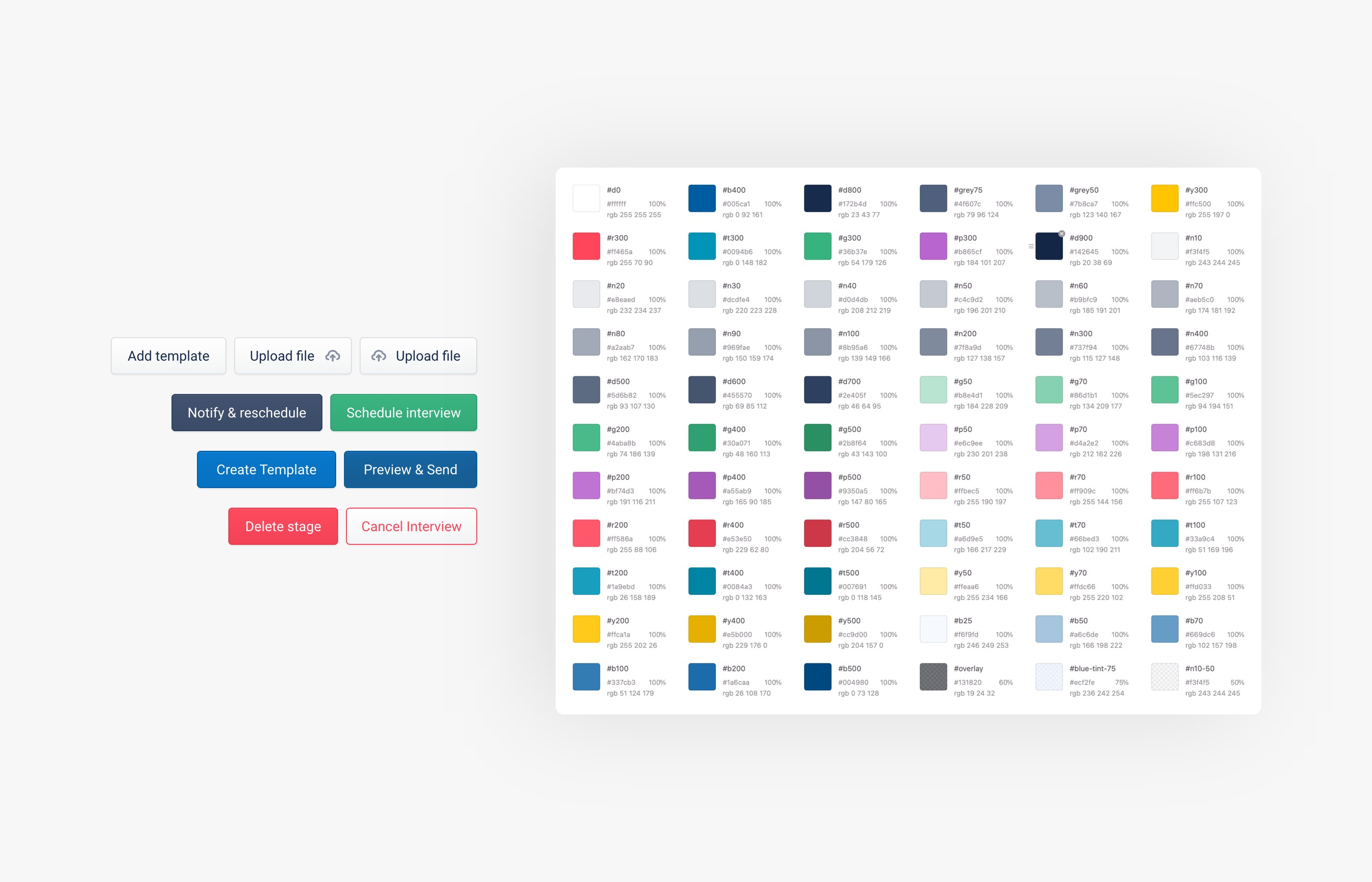
I started by mapping out all the existing UI components, font styles, color variations etc. Then I got rid of the redundant variations, leaving only the necessary ones.
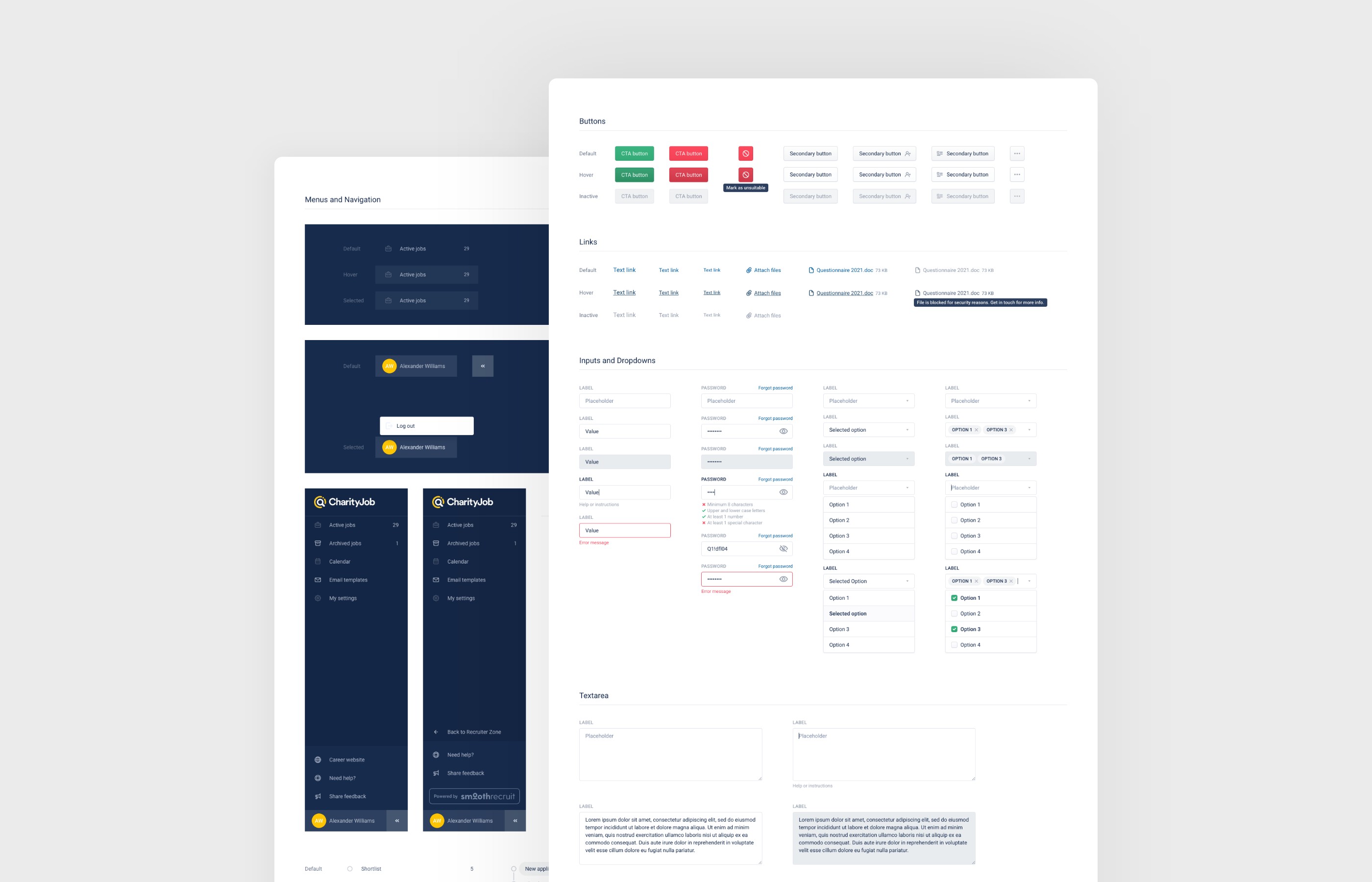
After this work, the existing UI regained consistency, but there were still some accessibility issues and we also wanted to give it a more modern look.
This is how a new design system was born. It is based on the same set of components, but with following accessibility rules and covering all possible component states, with improved specifications and structure, using a good naming format for the color palette, font styles etc. – making it easier to maintain and scale.
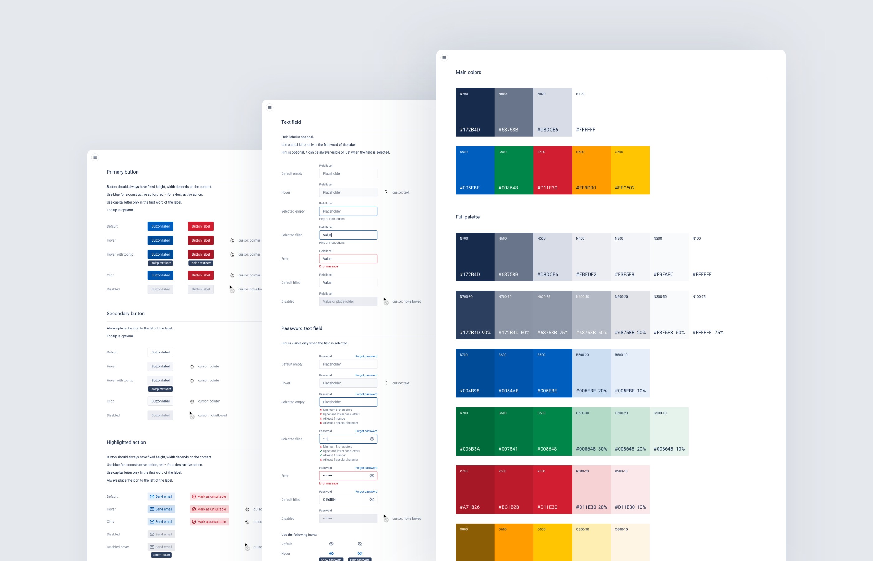
One of the biggest challenges was that we had to keep and maintain two versions of the design system (both in design and on the live website) for quite a while, because we decided to make this update gradually so as not to use all of our resources just for this process and to keep releasing a new valuable stuff for the users.
Based on our research we knew that typically there are at least two people involved in the hiring process (recruiter and hiring manager). These people need to evaluate candidates at each stage of the hiring process. We have noticed that sometimes some of our users leave notes in the candidate profile to do this, others use Excel sheets or similar tools to do evaluations outside of our product. So we were quite confident in the demand for this feature.
I started by gathering various ideas for this feature.
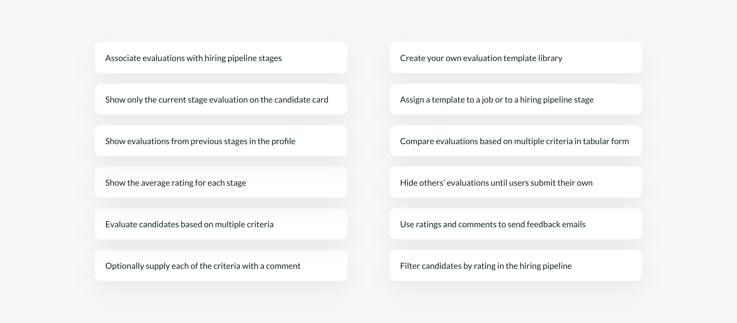
After discussing these ideas internally with the team, we have decided to roll out the simplest version first, see how it works, and then add additional functionality, if there is a demand for it.
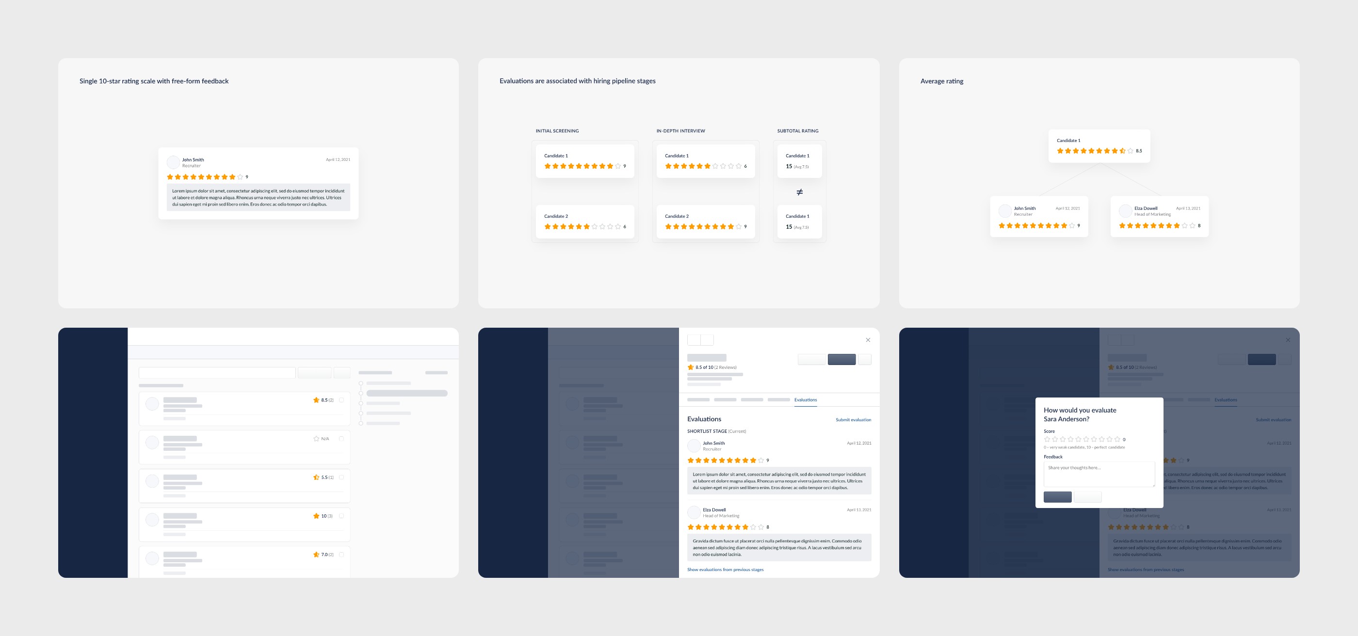
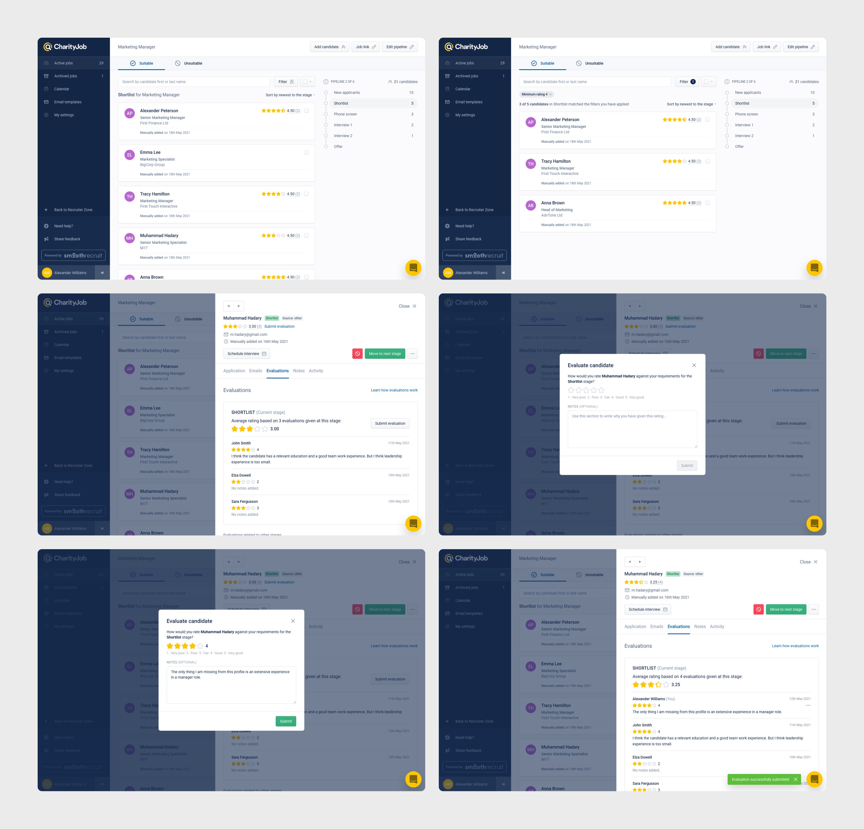
After speaking with some customers who had previously shown interest in this feature, I made several changes to our concept, such as changing the scale from 10 stars to 5 stars and defining what each of those 5 possible ratings means.
Here is the final solution as it was on the day of the first release:
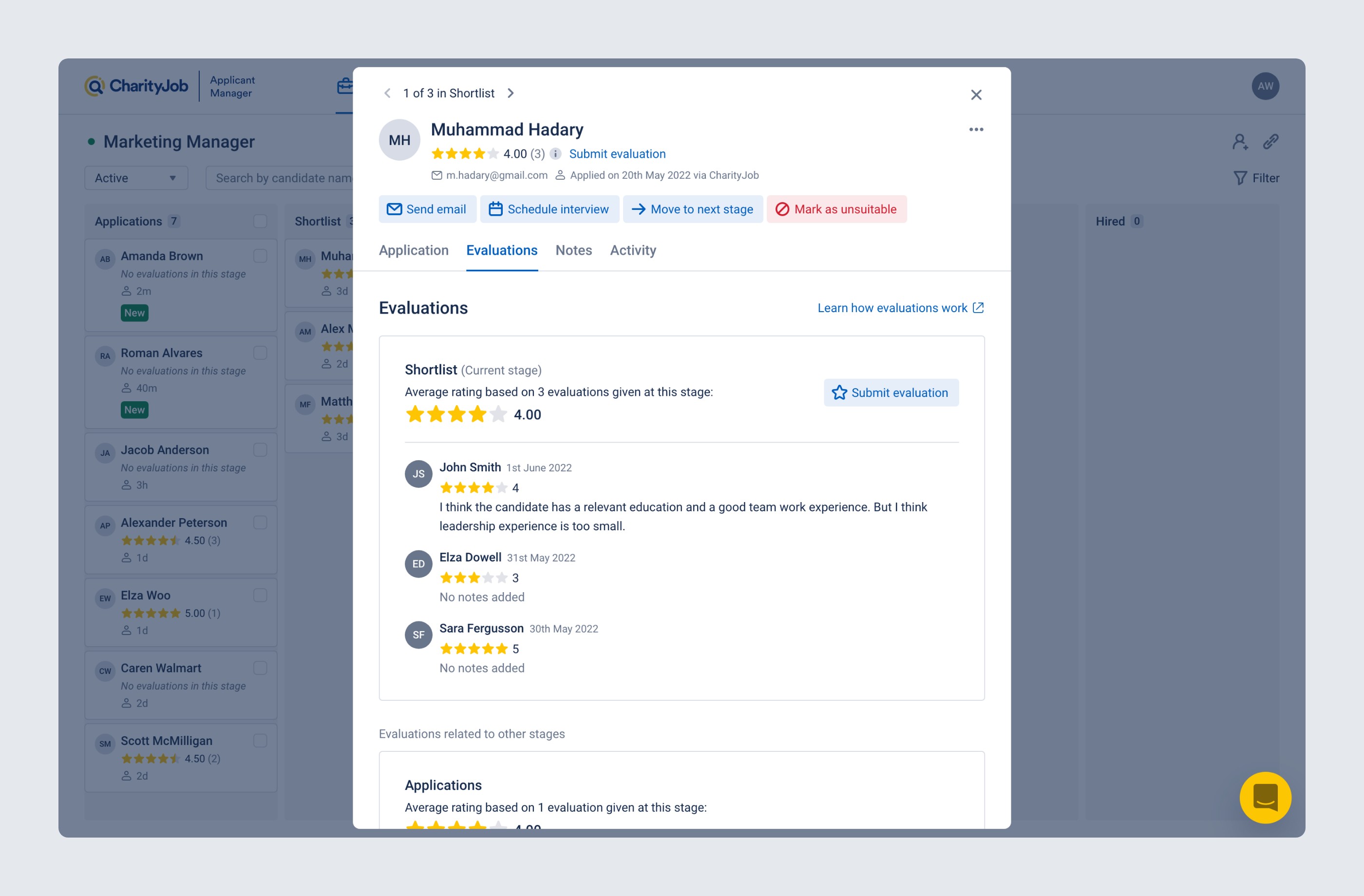
Here is how it looks today:
We knew from our customers that the current job page UI didn't work really well for them. Here are just a few of the major problems: it’s not convenient to move candidates between stages, it’s not clear who is in other stages, and it’s not easy to customize a hiring pipeline.
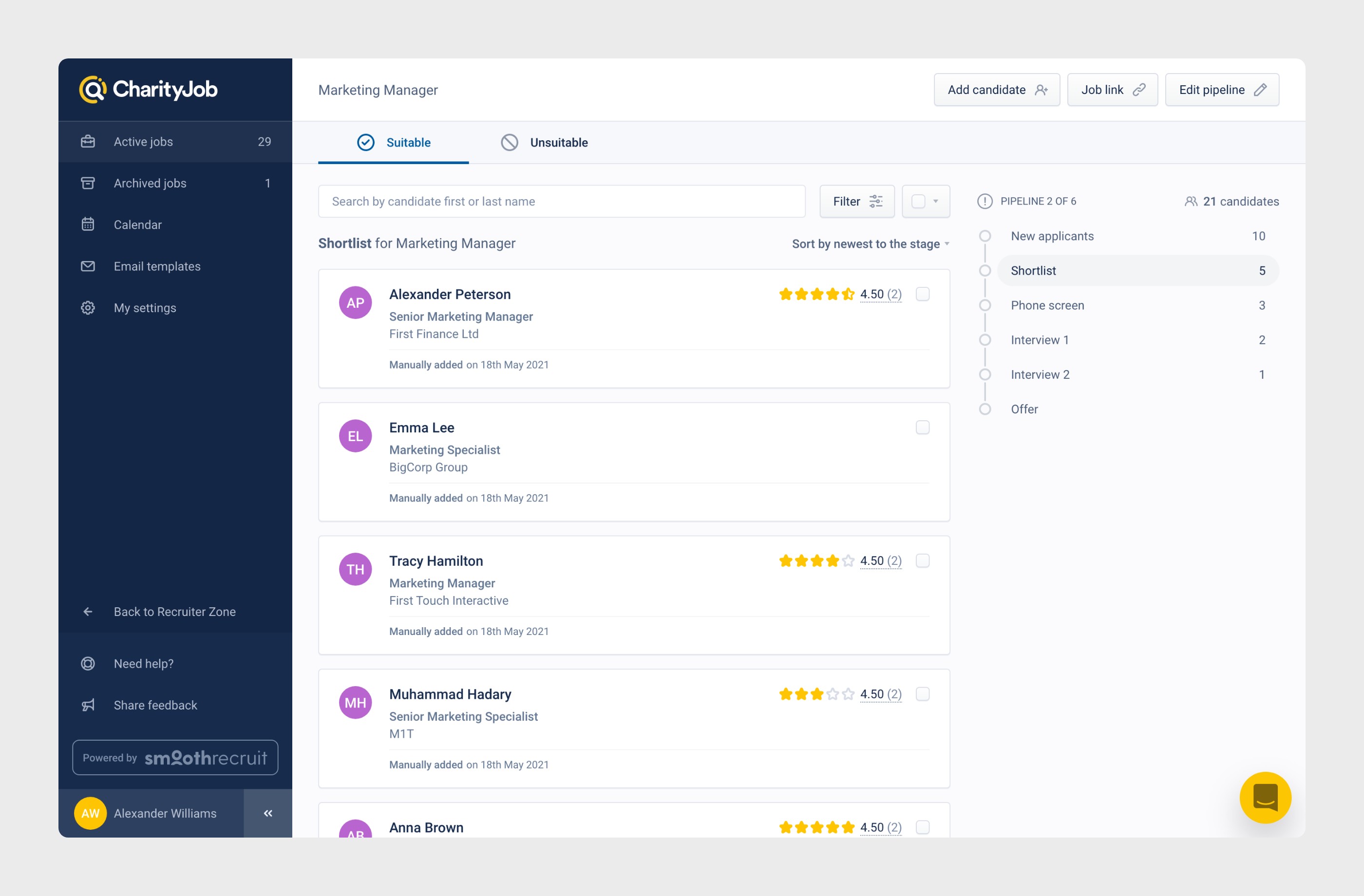
We knew that we needed to change it to a kanban board style, but also went through multiple rounds of internal validation as well as customer validation. Based on the feedback received internally, I removed some functionally that is not absolutely necessary to reduce the amount of work for our development team. Based on customer feedback, I deprioritized a few things, such as the hiring pipeline editing tools and job posting details, which also made the entire view clearer.
Here is the final version:
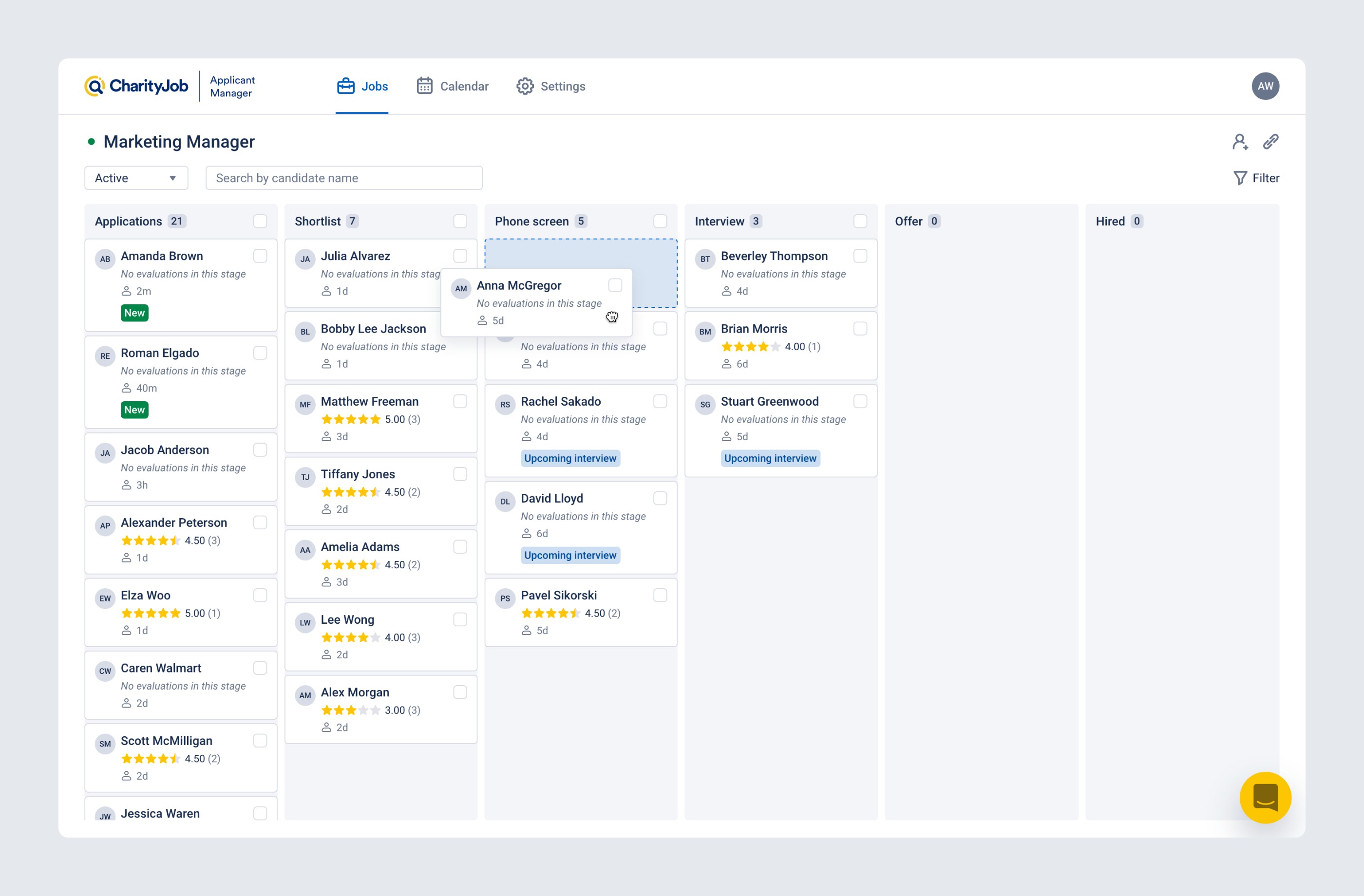
Since this project was mainly a front-end UI work, I was also actively involved in all processes during development: writing requirements for tickets, constantly communicating with developers, and doing design QA.
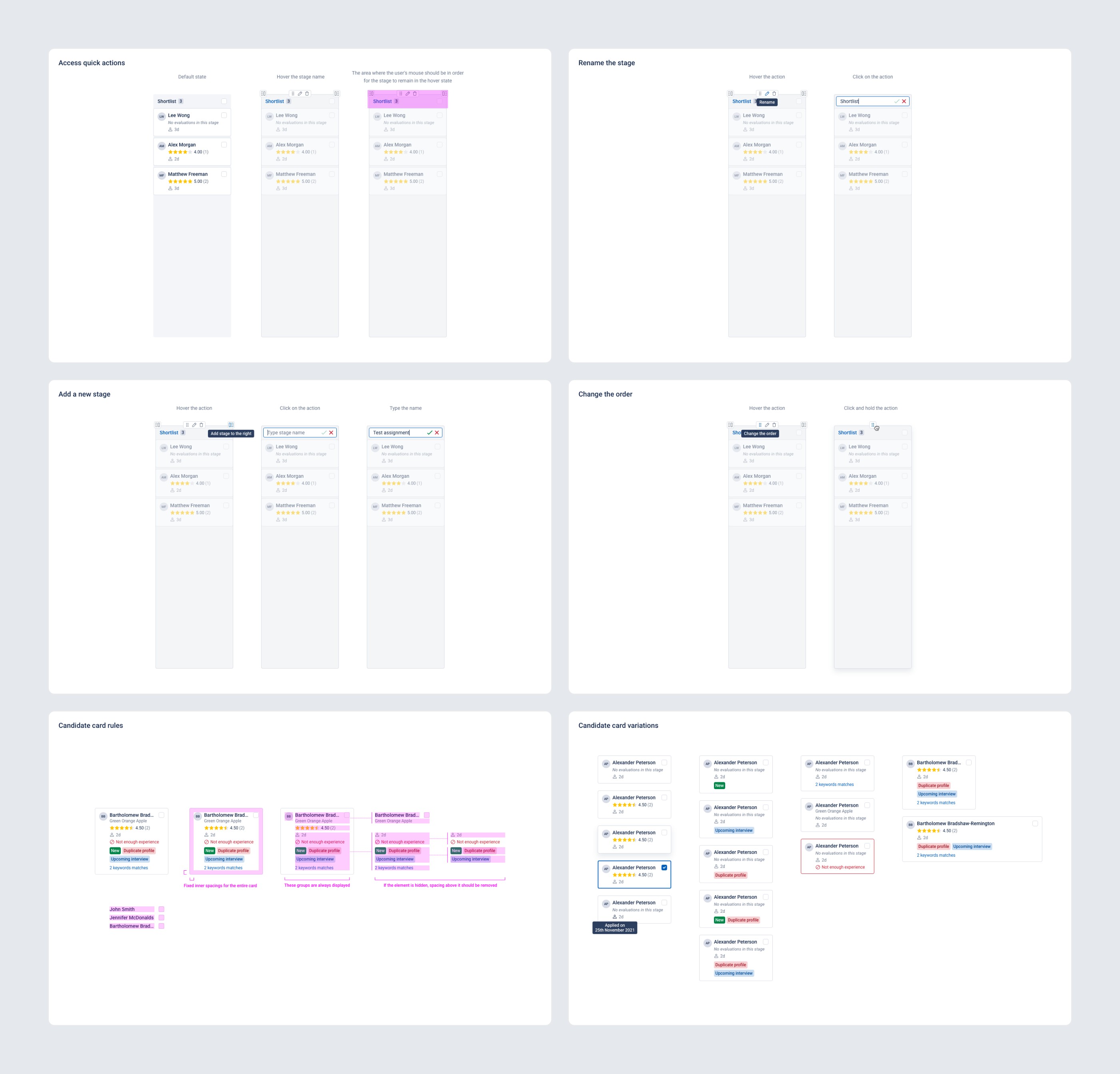
After releasing this feature, we started seeing really good stats and getting really positive feedback from our customers, however there were a few things that didn’t work as we expected for some of our customers. One of those things is that some of our customers were not able to scroll candidates within the hiring pipeline stage because we don’t show a scrollbar there. Originally we thought about those who might not be able to scroll horizontally (using trackpad or mouse) and put a horizontal scrollbar for them, assuming everyone can scroll vertically with their hardware, but the reality was different. So, one of the first things I had to add to our new UI is a scrollbar within each hiring pipeline stage. I didn’t want these elements to clutter up the entire view, so I made them appear dynamically only in case we can’t show all candidates inside the stage.
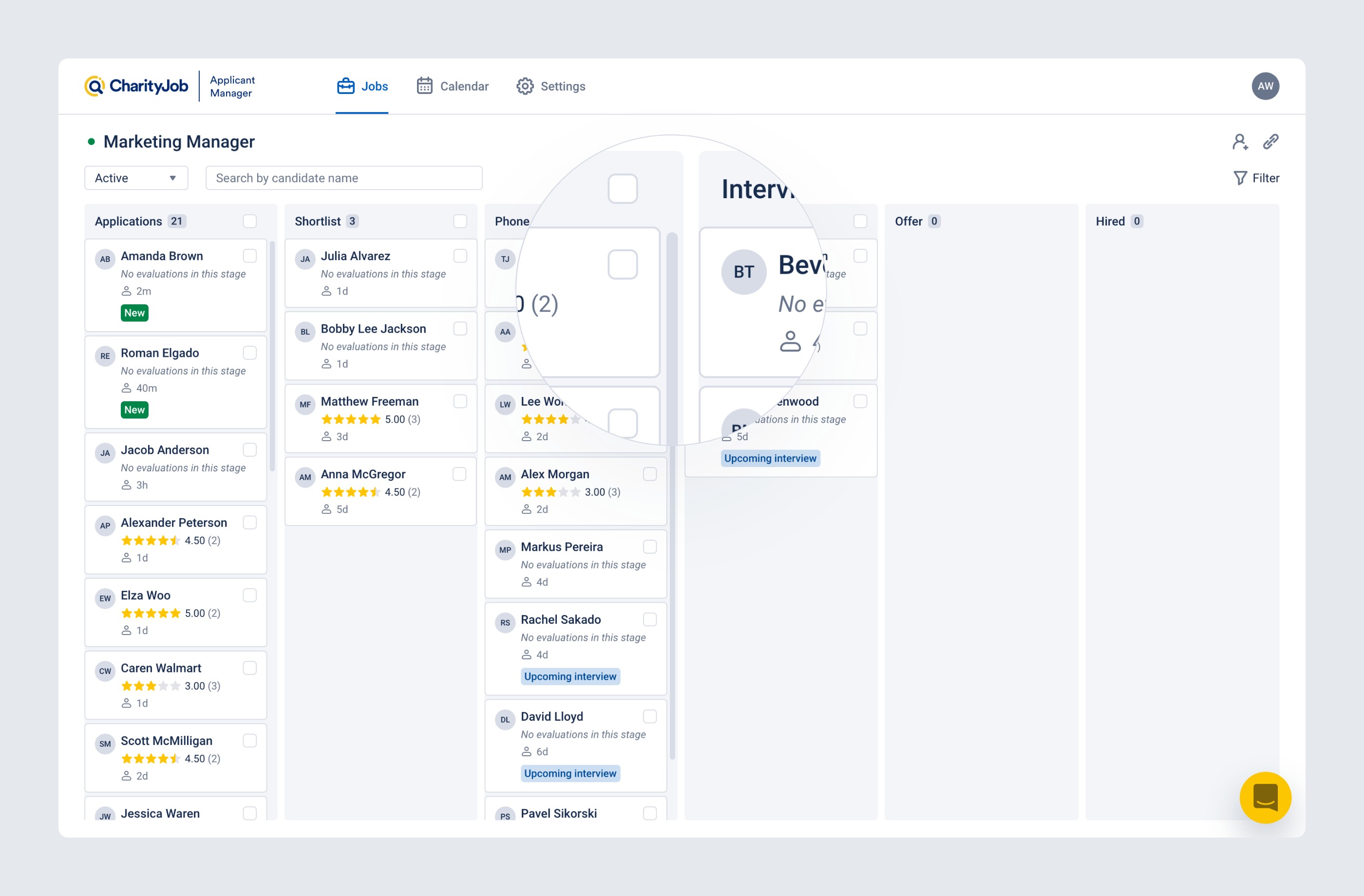
Along with the new job page UI, we decided to update the main navigation by moving it from the left sidebar to the top, thus freeing up more space for page content.
We've also updated the rest of the UI to use the new design system.
Here is how the final solution looks:
When I started at this company, they didn’t have an established design process and communication between the design, product, development and QA teams. Lack of communication was leading to misunderstanding and, as a result, to not desired results.
We tried multiple approaches, it took us some time, but finally we established a good workflow in accordance with the corporate environment. Its main part is a discussion of the solution design at all stages.
As I mentioned at the beginning, ATS was originally planned as a standalone product, so it was designed and built that way. But at some point the company decided not to bring it to the market as a separate product, so as not to compete with all existing solutions, but rather to fully integrate it in the main CharityJob product which is a job board with an ad manager.
This decision created several challenges, some of which we are still facing today.
The challenge number one was to create a high-level concept of two parts of the product (job board with ad manager and ATS) merged into a single product to see if it was technically feasible and how long it would take us to do it.
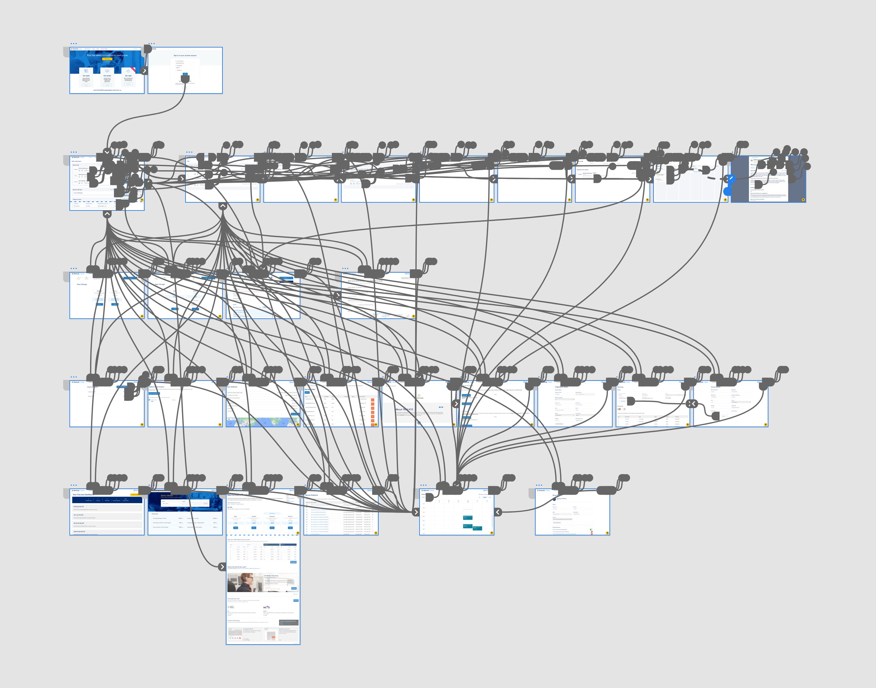
We went through several rounds of internal feedback on this concept, including all teams: management, development, design, QA and sales. Finally, we brought it to a state where everyone was satisfied, and got a green light to work on merging the two products.
But this is where the next challenge arises. Since the two products (job board with ad manager and ATS) were separate all the time, we had different visual styles, components and all resources for each of those parts. Obviously, we had to do some preparatory work to unify the UI before the merge.
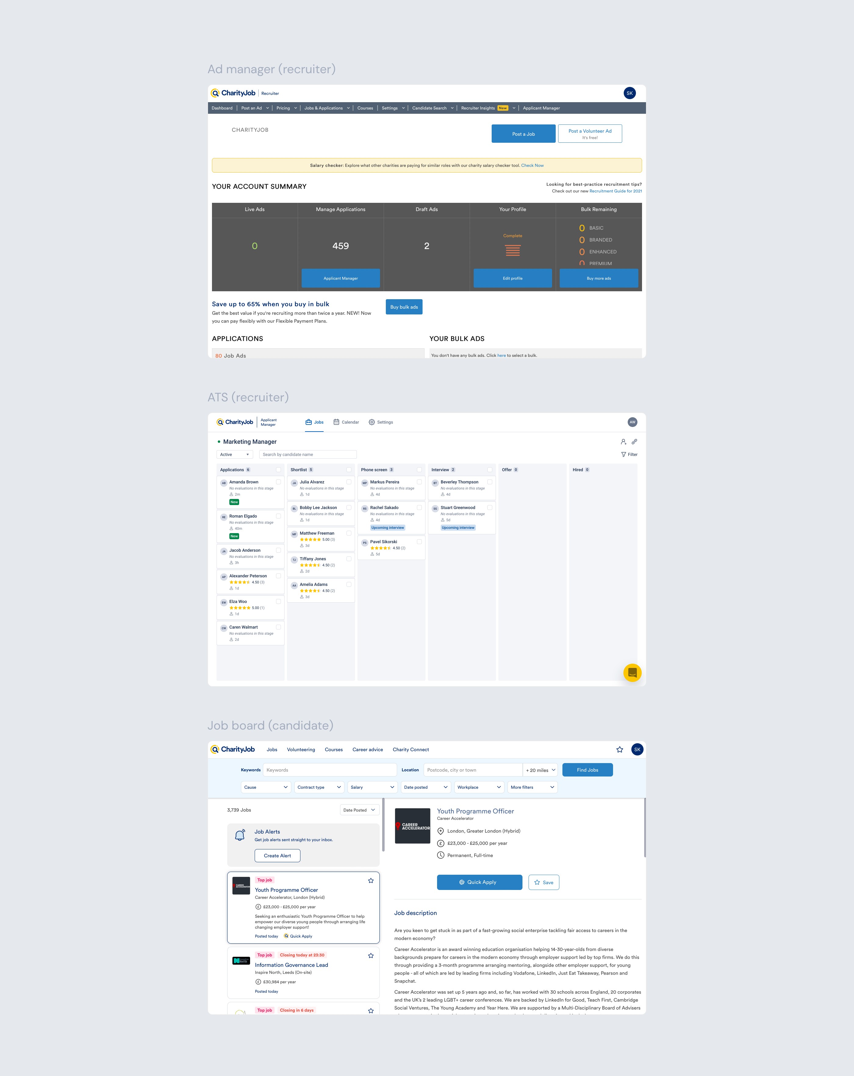
So the next step for me was to propose how we can unify the UI of different product parts.
I came up with a concept that combines the latest job board UI and ATS UI, and keeps it connected to the CharityJob brand.
Now all the different parts of the product have a consistent look and feel. The UI looks modern and is easier to maintain and scale.
Here is how this concept looks when applied to actual screens.
The next challenge was that our designs were spread across two different tools: Figma for job board and ad manager, and Adobe XD for ATS. So, after we agreed on the direction for unifying the UI and building a single design system, we also agreed to use one design tool, since all future work will be cross-product parts, and each designer will need to have all the resources at hand.
So besides building a new design system and updating the entire UI, I have to move all the existing ATS stuff to Figma.
At the moment the new UI and the merged product are being gradually built and released.