
ConvoTasks is an innovative mobile application that allows users to create, manage and work with checklists individually or with their team members.
One of the competitive advantages of this app is that users can interact with all basic functions: set time- and location-triggered checklists, create customized templates, reminders and much more – using voice commands.
The client had just an initial idea and some real-life use cases.
The first thing I had to do in collaboration with the team was our own research to understand the existing services (competitors), understand the target audience and validate the client use cases.
For the competitve analysis we took 3 most popular to-do list apps to understand what they do and how we can compete with them.
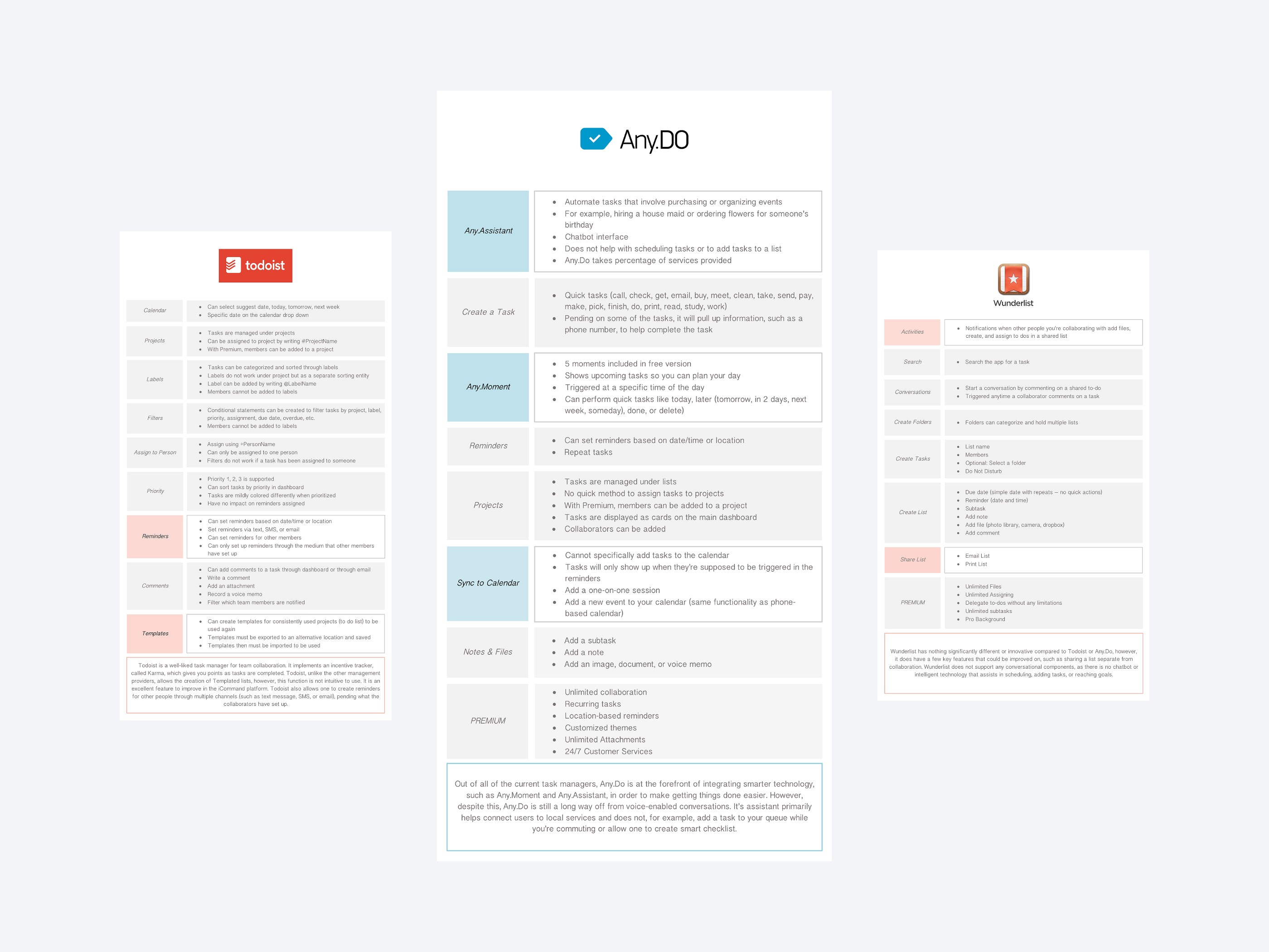
Based on the research we have defined the following features that might be a competitive advantage:
- Voice control mode
- Teamwork
- Custom templates
Research has also shown that there are two groups of users that we can target:
1. Business – real estate, technology, service organizations, repair, automotive and manufacturing industries that require staff to follow strict checklists and verify the quality of their work.
2. Individuals – people who will use the app to organize their own short and long term goals as well to manage duties within their family.
Both of these two groups have specific requirements that need to be met.
Our research helped to define the final product scope and strategy in details.
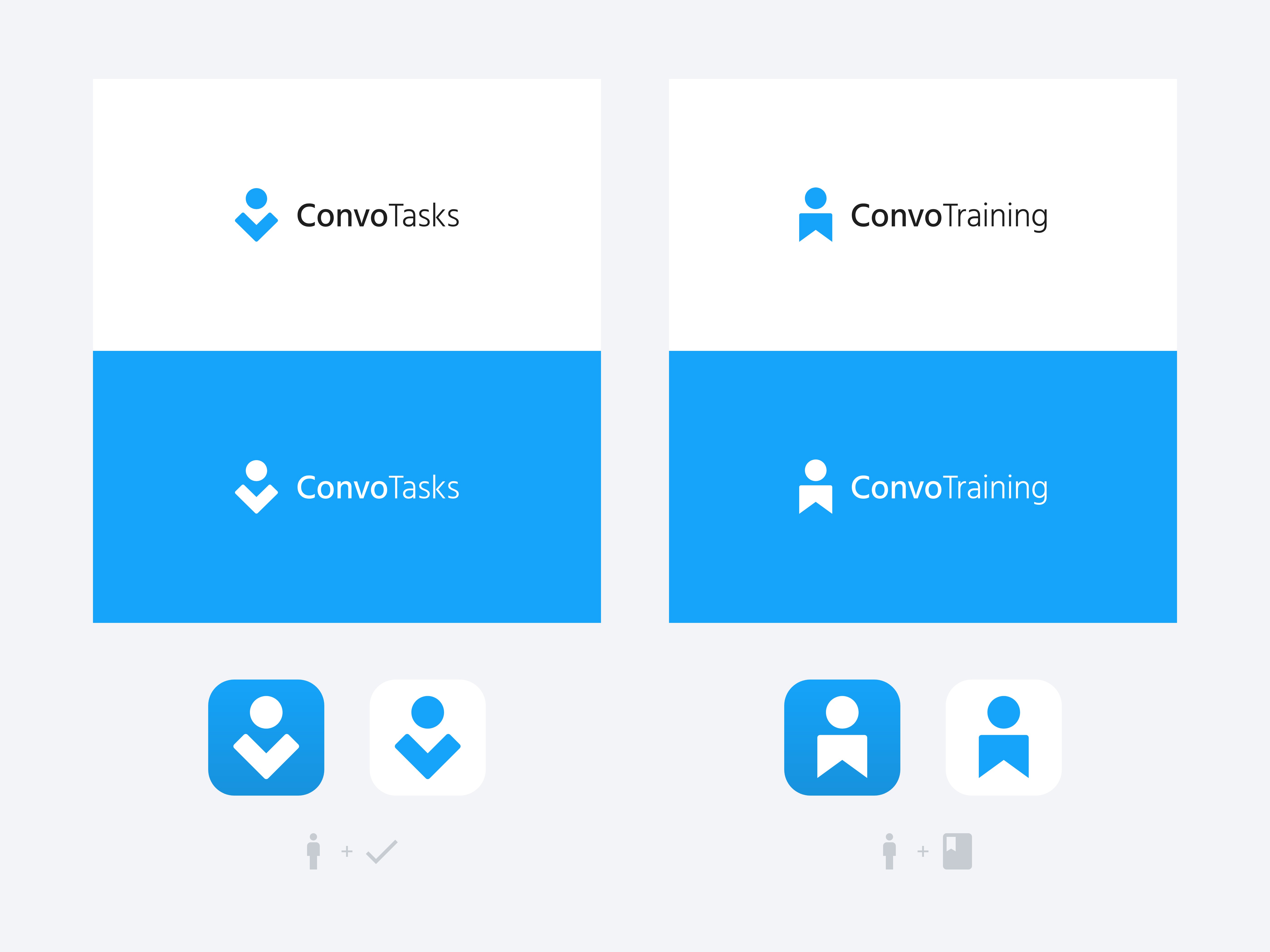
The goal for the logo and branding was to create something simple, clean and memorable. Since the emblem should be used on a variety of media in different sizes, it should be simple and look good in both extra small size and very large size.
It was also very important to keep in mind that company planned to release a bundle of products under the same brand in the nearest future.
So finally I came up with a solution in which all products contain "Convo" in their names, but different emblems and the second part of the name – this should add consistency to the entire product line, while maintaining the uniqueness of each individual product.
Since the customer provided complete freedom in making design decisions and we were well prepared (research, use cases, detailed product scope etc.), I decided to start directly with a high-fidelity wireframes.
This approach takes a bit more time during the initial stage, because you need to to define the visual direction, but finally it saves a lot of time, since you don't need to rebuild all screens from low or mid-fidelity state.
The main part of this product is a mobile app. It’s a hybrid app built on the React Native framework. Below you can find screens of the iOS version as it was the main focus, but there also was a customization for the Android version to make it look closer to the native app.

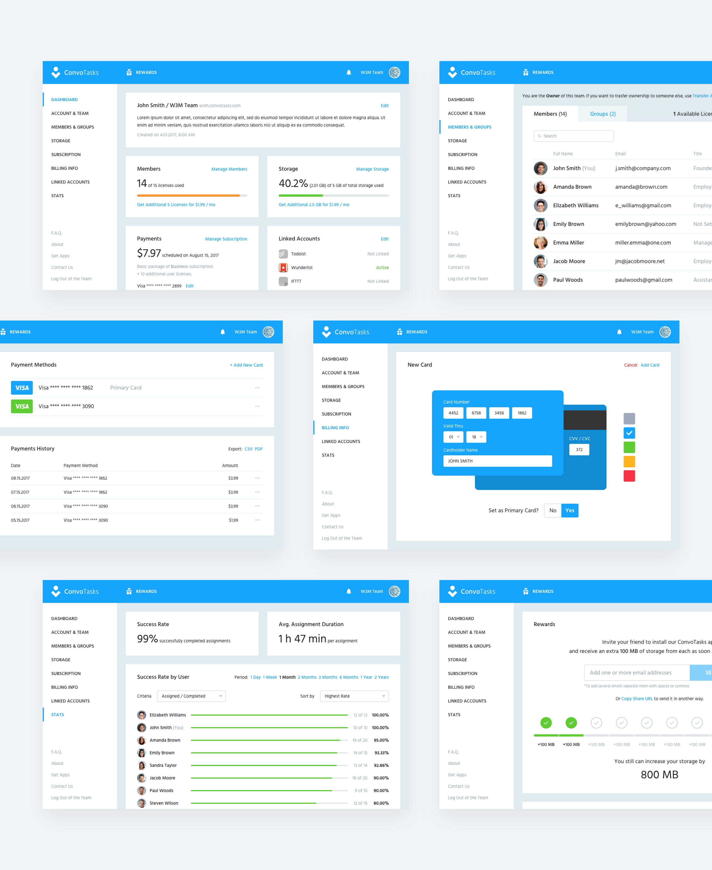
The purpose of this web app is to provide the user a convenient way to manage all account related things like team members, subscription, payments, storage etc.
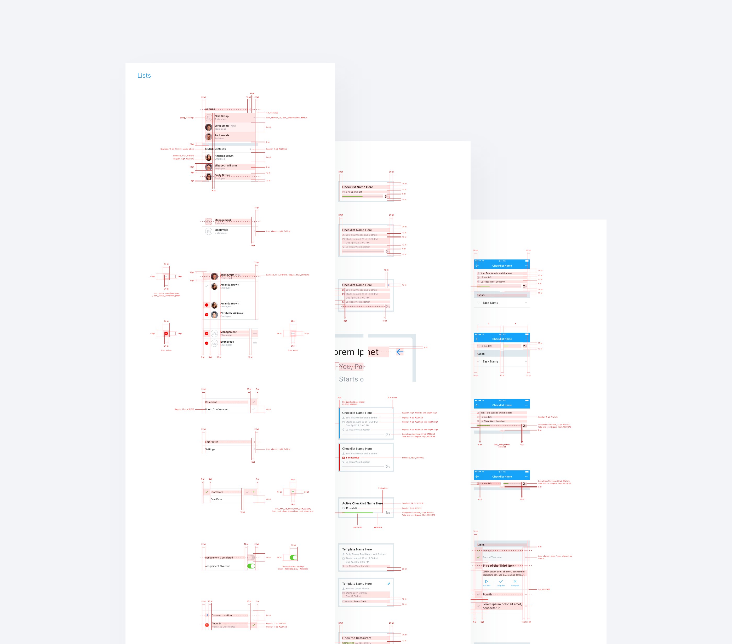
For this particular project, besides providing all necessary design resources to the dev team, I also created detailed specs for all components of both mobile and web apps.
